2016 Trend Colors and Color of the Year for Salon Marketing
Salon Marketing Ideas: 2016 Trend Colors and Color of the Year
Using 2016 Trend Colors and Color of the Year in Salon Retail and Marketing
Runway trends don’t lie. Whether Pantone’s pick for 2016 trend colors of spring or their selection of two colors to share the honor of 2016 color of the year drive or are driven by the world of fashion scarcely matters, the result is the same. This year’s trend colors for spring are subtler than the bright colors which have dominated fashion color trends in years past, but they’re still capable of making a strong statement.

While the bright colors and primary colors that have been part of trend color palettes in the last several years made for eye-catching nail lacquer displays, the colors did not lend as well where more subtle colors are preferred, such as eye shadow. Not so this year, with many of the 2016 trend colors easily translating to colors for both nail polish and eye shadows as well as the clothing and accessories consumers will be seeing in stores this year.
Using 2016 Trend Colors in Salon Marketing, Displays and Décor
I’ve touched on the idea that you can purchase in retail products such as eye shadows and nail lacquers in trend colors in order to create on-trend eye-catching retail displays. Here are some other ways you can use trend colors to boost sales of retail products or influence the client experience in your salon:
- Pair eye-shadow or nail lacquers in trend colors alongside “As Seen In” photos from magazines that show celebrities using the colors themselves
- Hold a fashion makeup demo event showing clients how to pair fashion colors with clothing and accessories with their choices for makeup and hair
- Add pops of color in pillows, vases, decorative pieces or other accessories to your waiting area
- Paint a focal wall or desk-front in one or more trend colors and change them out each season for interest
- Infuse the color into your marketing pieces, such as coupons or flyers
- Talk about trend colors on your own website, blog and email newsletters (EVERYONE loves color!)
- Have a contest or hold a vote letting people weigh in on which is their favorite in order to add new social followers or build up your email contact list – draw names for winner/s for gift cards or retail products
You might also like: How Pantone’s 2016 Trend Colors Impact Marketing and Branding
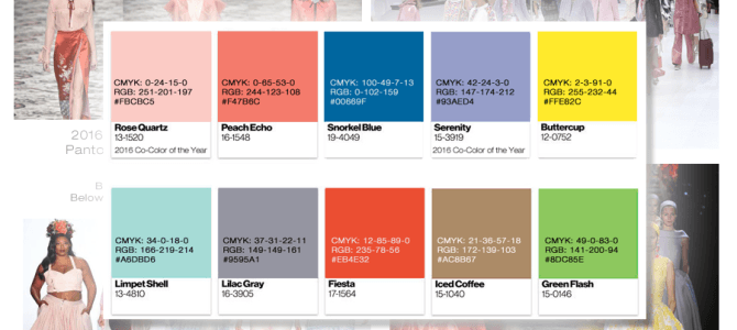
Let’s take a closer look at the 2016 trend colors and the two colors selected by Pantone for the honor of Color of the Year, Serenity and Rose Quartz

- Rose Quartz – #FBCBC5 html and CMYK 0-24-15-0
- Peach Echo – #F47B6C html and CMYK 0-65-53-0
- Snorkel Blue – #00669F html and CMYK 100-49-7-13
- Serenity – #93AED4 html and CMYK 42-24-3-0
- Buttercup – #FFE82C html and CMYK 2-3-91-0
- Limpet Shell – #A6DBD6 and CMYK 34-0-18-0
- Lilac Gray – #9595A1 html and CMYK 37-31-22-11
- Fiesta – #EB4E32 html and CMYK 12-85-89-0
- Iced Coffee – #AC8B67 html and CMYK 21-36-57-18
- Green Flash – #8DC85E html and CMYK 49-0-83-0
A few impressions from the get go.
For those that like primary colors, Buttercup, Snorkel Blue, Fiesta and Green Flash will get you tantalizingly close. Those that love the gray/yellow pairings that have been popular in recent years will be happy to see that Lilac Gray and Buttercup fit the bill. And again, Fiesta and Green Flash would both be great pops of color set against Lilac Gray as well. Iced Coffee and Green Flash represent the only earth/nature tones in the palette.
Lilac gray + Serenity + Snorkel Blue could be combined for a more monotone-ish color palette, as could Rose Quartz + Peach Echo + Fiesta. In fact, I don’t remember any trend color palettes in recent years having such a tightly-connected group of colors.
And on to the two co-crowned colors of the year, Rose Quartz and Serenity.
 Pantone is billing the pairing of two colors, Rose Quartz and Serenity for the 2016 color of the year as an attempt to challenge traditional perceptions of color association as the world experiences a “gender blur,” and as coinciding with society’s move toward gender equality and fluidity. Both tones speak to reassurance and serenity as consumers “seek mindfulness and well-being as an antidote to modern day stress.”
Pink and blue, seen together like this, might make you instantly think of baby blue and the pink that would be chosen for nursery paint colors, bedding, accessories and clothing for an infant. Certainly both are a wide departure from last year’s color of the year, Marsala.
Finally, (since I know you LOVE color!) here’s a graphic I created that shows all of the Pantone color of the year colors from 2000 to 2015.

***

Get Client Rules: 2016 Marketing Calendar for Salon and Spa and get 12 months of marketing ideas for growing a salon business including the salon marketing strategies you need to attract new clients in today’s digital salon marketing landscape.
Perfect for salon owners but also easy to implement for any beauty industry professional – from booth renters and hair dressers to estheticians, nail techs, salon suite franchisees and anyone who wants to know how to grow salon clientele and keep clients engaged for the long haul.


