
The Psychology of Color in Branding and Marketing Design + Infographic

Choosing colors in design is always a big part of the process when creating something new. Most people don’t understand how subjective color is, though, so it can become a point of contention, as participants argue, hoping to convince others to see their point of view.
Why does this happen?
People tend to think that their own preferences—whether in choice of color or in design elements—are “right” or somehow superior to those of others.But that’s like saying that one person’s favorite foods is superior to another’s.
As a graphic designer, it is very help to know this, because it’s nearly impossible to keep our own preferences out of the design and branding mix. And sometimes what the client wants is far removed from our own design point of view. Once you understand which elements of the brand design process are subjective, based on personal preferences, it helps the designer to let go of control in some areas they might otherwise feel compelled to argue for, if they believe that their point of view is “right.”
When you are choosing colors for a design project or within a branding process, if you can keep in mind that your preferences are just that, you can become open to a more objective, analytical brand analysis that should result in a better outcome for your business.
Understanding the psychology of color and the associations that people in western cultures have relative to certain colors is one way that you can take a more objective approach when it comes to designing crucial elements of your visual brand identity.
If you want to further your study of the meanings of color, especially as it relates to the branding your small business or marketing communications, you will love Pantone’s Color: Message and Meanings A PANTONE Color Resource by Eiseman.
To that end, I want to share this infographic from TestKing.com as introductory to your study of color in branding. As your first exercise, after taking in the information contained here, you might spend a few minutes analyzing the landing page of your website, your logo or other elements of your visual brand identity or corporate communications and think about where you could better use color strategically, what may need to be revisited and what kinds of messages your visual color cues might be sending to your customers.
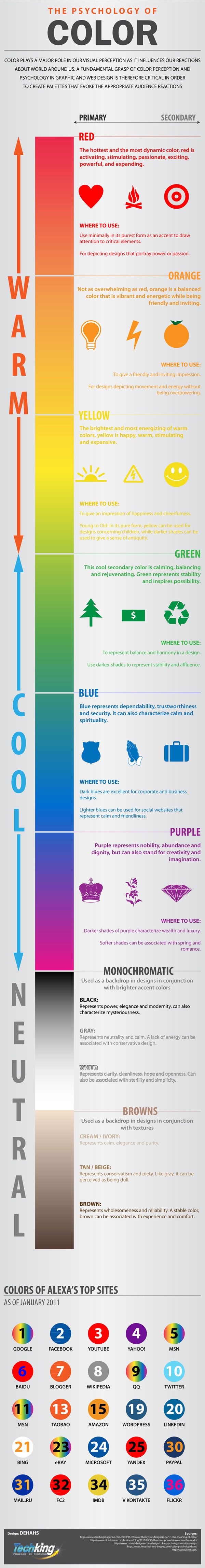
The Psychology of Color by Tech King
***
Elizabeth Kraus is the author of 365 Days of Marketing.
365 Days of Marketing is available on amazon.com in print or digital format. It contains marketing how-to, inspiration and content for every day of the year that can help you cultivate buy-in and loyalty from among your employees as well as your customers, and give you the tools you need to hone your leadership and management skills.


Trackbacks & Pingbacks
[…] a fall trend color into your brand identity palette for the long haul it needs to embody the associations that will resonate with your target audiences over the long term, not just for one […]
[…] with their own preferences, and sometimes cultural perceptions about colors, there might be. The Psychology of Color infographic published previously talks about color and cultural significance, and it’s worth a quick […]
[…] The Psychology and Use of Color in Branding and Marketing Design (365daysofmarketing.wordpress.com) […]
Leave a Reply
Want to join the discussion?Feel free to contribute!