The Easy – Breezy – Beautiful 2017 Spring Trend Colors
Why 2017 Spring Trend Colors Matter
As trend colors change each season, so does public perception about whether your business, brand, or products are relevant and new. While your brand’s colors are likely unchanging over time, it doesn’t mean that all the colors you choose to use in online and offline marketing, advertising, and displays have to stay the same. Giving a nod to 2017 spring trend colors in the items you stock for purchase, accessories, and so on helps buyers connect with whatever you’re trying to sell, and could impact any number of the following types of businesses:
- Retail and wholesale home furnishings and wares
- Retail and wholesale clothiers
- Purchasing directors and buyers
- Wedding suppliers and professionals
- Event planners
- Real estate home stagers
- New home builders
- Salon beauty, skin care and make up professionals
- Brand marketers – and more
Consumers and business buyers alike will be seeing 2017 spring trend colors on runways, in the pages of their favorite magazines, during red carpet celebrity coverage and so on. If your business is helped when customers perceive that you’re up to date on current trends, it can establish you as an expert resource; a leader instead of a follower.
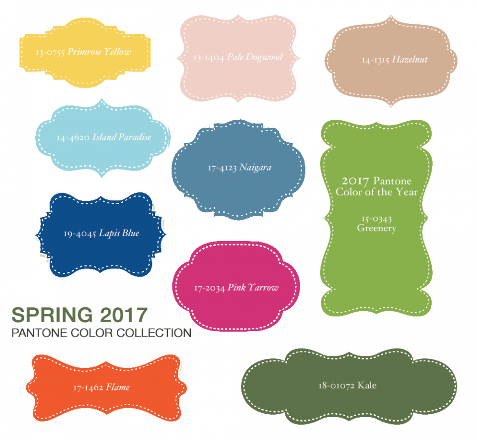
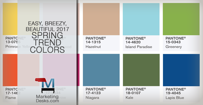
Let’s take a closer look at Pantone’s Top 10 2017 Spring Trend Colors including Greenery, which could be the freshest color of the year ever.
What’s in the 2017 Spring Trend Colors Palette
The Pantone® 2017 spring trend colors palette is one of the most cohesive palettes in recent years. Nearly every color can be used successfully in combination with the others, with a dominance of hues taken straight from nature: leaves, needles, water, oceans, sand, sun, and sunflowers.

Greenery, Pantone’s 2017 Color of the Year
Pantone 15-0343 – RGB 136-177-75 – #88B14b – CMYK 53-13-93-1
Primrose Yellow – Pantone 13-0755
RGB 246-210-88 – #F6D258 – CYMK 4-15-77-0
Pale Dogwood – Pantone 13-1404
RGB 239-206-197 – #EFC3C5 – CMYK 4-20-17-0
Hazelnut – Pantone 14-1315
RGB 209-175-148 – #D1AF94 – CMYK 18-31-41-0
Island Paradise – Pantone 14-4620
RGB 151-213-224 – #97D5E0 – CMYK 39-1-11-0
Flame – Pantone 17-1462
RGB 239-86-45 – #EF562D – CMYK 1-81-93-0
Pink Yarrow – Pantone 17-2034
RGB 209-48-118 – #D13076 – CMYK 15-94-26-0
Niagara – Pantone 17-4123
RGB 85-135-162 – #5587ª2 – CMYK 70-38-26-1
Kale – Pantone 18-0107
RGB 92-113-72 – #5C7148 – CMYK 64-38-80-22
Lapis Blue – Pantone 19-4045
RGB 12-76-138 – #0C4C8A – CMYK 100-78-18-4
Fresh Ways to Use 2017 Spring Trend Colors in Your Business
While you shouldn’t alter your brand’s core essence every six months just because new trend colors come out, you can take inspiration from the palette and use its colors to refresh your company’s print and digital ads, email communications, waiting rooms, reception areas, artwork, seating areas, menus, public restrooms and more.
Why bother? While making small changes to digital and print ads or business furnishings and accessories can generally be done at a low cost, it’s not like it costs nothing at all. Not only can it mean an investment of money to purchase items or pay for design time, it’s also the cost of time to plan, install, and otherwise place items with 2017 spring trend colors where they belong. The payoff comes in many forms; such as:
- Renewed customer interest
- Providing for client comfort and creating intrigue
- Helping customers see your business with fresh eyes
- Catching the eye of customers
- Creating talking points
And color matters – oh, so much. Consider some of these statistics about the power color has to influence customer sentiment and buying behaviors:
Color Trumps: 93 percent of respondents in research conducted by the secretariat of the Seoul International Color Expo said they put the most importance on visual factors when making buying decisions, compared to 6 percent who said sense of touch and 1 percent who said sounds or smells made the most impact.
Color Trumps Again: In the same study, 85 percent said color accounts for more than half of all factors influential in their buying decisions. Plus, color ads are read as much as 42 percent more often than the exact same ads if they are black and white.
Color Trumps Quickly: Most people make snap judgments about people, places, or things within 90 seconds of initial exposure; as much as 90 percent of that judgment is based on color alone.
Color Trumps Time: Color images hold visual attention for two seconds or longer while black and white images may sustain visual interest for less than 2/3 of one second. Plus, color association helps people remember and recall presentations, brands, products, and businesses. Specifically, high levels of contrast captures and retains visual attention, which, in turn, influences memory retention.
***
If it’s time to refresh your brand with a new color palette or total design, we can help. Reach out for information about our design services or consultative research to help you discover which colors and images could make the most impact for your brand.
[contact-form to=’all3@marketingdesks.com’ subject=’Web form – interest in design services’][contact-field label=’Name’ type=’name’ required=’1’/][contact-field label=’Email’ type=’email’ required=’1’/][contact-field label=’Website’ type=’url’ required=’1’/][contact-field label=’Comment’ type=’textarea’ required=’1’/][/contact-form]


Trackbacks & Pingbacks
[…] The ones we’re showing here are in timeless colors that also happen to be included in the Pantone© 2017 Spring Trend Color palette, making them an especially great choice for those buying new homes with white kitchens or […]
Leave a Reply
Want to join the discussion?Feel free to contribute!