
5 Corporate Brand Color Palettes Inspired by the Pacific Northwest
We’ll show you how the colors from five popular Pacific Northwest favorite locales can be incorporated into corporate brand color palettes, and what type of companies would be most likely to use them.
5 Seattle-Area Venues Provide Inspiration for Corporate Brand Color Palettes
If you have a favorite location, chances are it’s as much about how the environment there makes you feel as it is about what occurs at the venue itself. We feel especially lucky that our marketing agency is located in the greater Seattle-Tacoma region, because color inspiration is all around us.
Whether we’re walking the beach in Gig Harbor, taking in Puyallup’s Daffodil Festival, in Seattle at Pike Place or on the campus of UW when the cherry blossoms are in full bloom or we’ve taken a day trip to Tipsoo Lake on Hwy 410 near Mt. Rainier, we have an opportunity to draw creative inspiration from every day, and every setting where we might find (or lose!) ourselves. Here are five of our favorites in terms of corporate brand color palettes where they might be most effectively used.
5 Seattle-Tacoma Area Inspired Corporate Brand Color Palettes
1. Sunrise Beach County Park in Gig Harbor

Rooted in neutrals of all hues and earthy, luxe greens and blues, the colors of Sunrise Beach County Park in Gig Harbor would be an elegant choice for brand’s who want to convey restful, luxurious and calm. As brand color palettes go, this could be an ideal choice for any type of business that wants to soothe, reassure, and inspire trust, such as a spa, medical or dental practice, financial institution, health foods store or organic grocer.
2. Pike Place Public Market Center in Seattle

The iconic Pike Place Public Market Center in Seattle is a perennial favorite with both tourists and Pacific Northwest residents alike. Walk inside to see the infamous fish-tossers in action, choose your salmon or seafood and then grab a few bouquets of locally-grown flowers to adorn your table when dinner is served. On a sunny day, the easily-recognizable red letters of the Public Market Center are framed with the clearest of sky blues, and accented in the building’s architecture with gray, teal and brown-black. Incorporating these hues into corporate brand color palettes might work best for companies like barber shops, gentlemen’s clubs, new home construction companies, commercial builders, building supply companies and contractors, fitness centers, recreation centers, marine supply stores, and so on, but could be equally effective as part of the brand identity for diners.
3. The Daffodil Fields in Puyallup and Pierce County
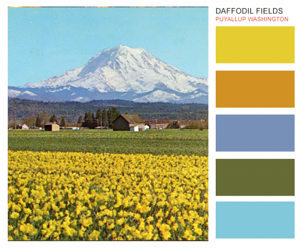
Nothing boring about this color palette featuring the fields that provide daffodils for Puyallup and Sumner’s Daffodil Festival as well as local grocery stores and florists. It’s all energy with just a hint of grounded-ness coming from the distant foothills and underlying flower stalks and stems. The types of companies that might want to use these high-energy colors in brand identity could be grocery stores, trucking and transportation, senior living and senior services brands, fast food restaurants and children’s clothing stores.
4. The Cherry Blossoms at UW (University of Washington) – Main Campus in Seattle
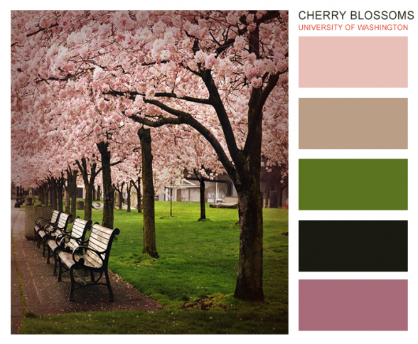
Soft and feminine pinks, olive green and deep brown make this an ideal color palette for brands serving largely female clientele; however, the colors also translate for kids clothing and furniture stores, fragrance stores, tea shops, spas, salons, and anywhere else where women are likely to make up the vast majority of the brand’s target market. Find more photos of UW cherry blossoms in full bloom at Komo.com.
5. Wild Flowers at Lake Tipsoo, Mt. Rainier National Park at Chinook Pass on Highway 410
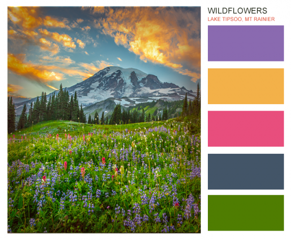
Last but certainly not least, the colors of the wild flowers to be seen at Chinook Pass’s Lake Tipsoo in the Mt. Rainier National Park might just bloom a little brighter than all the rest, knowing that they’re likely to be covered up by winter snows for up to 8 months every year. Among these we found playful yellows, purples, blues, and bright pinks surrounded by energetic earthy greens, all sitting just below Mt. Rainier – the well-known peak which dominates the landscape in the greater Seattle Tacoma region. Brands that use these colors need to be young, or at least young at heart – and fearless! These could be great color choices for corporate brand color palettes of day cares, kid-friendly restaurants, bouncy-houses, kids toy or clothing stores, and celebration-oriented venues.
If you’ve never thought of your local environment in terms of brand color inspiration, it’s time to start. Choosing colors from local venues can help your brand establish memory points with customers as you take what might already be familiar hues and make them your own.
We would love to be part of your story.
We can walk you or your whole team through a branding exercise that helps you create or strengthen your brand’s identity, covering everything from mission and vision to brand colors and feel. Reach out for information about a virtual or in-person branding consultation or workshop:
[contact-form to=’all3@marketingdesks.com’ subject=’web form – branding info request’][contact-field label=’Name’ type=’name’ required=’1’/][contact-field label=’Email’ type=’email’ required=’1’/][contact-field label=’Website’ type=’url’/][contact-field label=’Best number to reach you’ type=’text’/][contact-field label=’How can we help?’ type=’textarea’ required=’1’/][/contact-form]


Trackbacks & Pingbacks
[…] You might also like: 5 Corporate Brand Color Palettes Inspired by the Pacific Northwest […]
Leave a Reply
Want to join the discussion?Feel free to contribute!