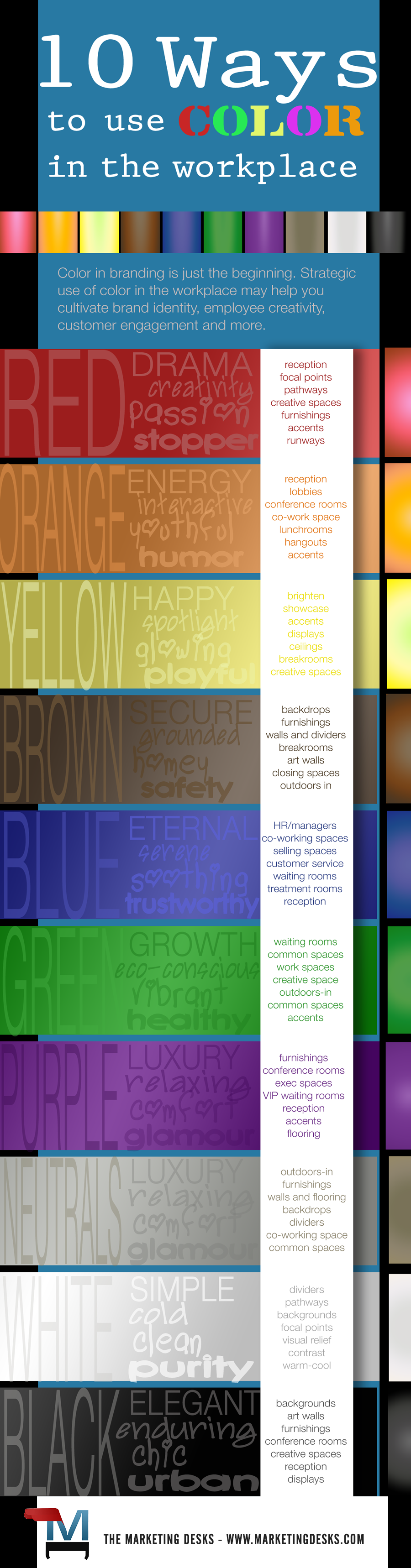
10 Ways to Use Color in the Workplace Infographic
Color in branding is just the beginning. Strategic use of color in the workplace may help you cultivate brand identity, employee creativity, customer engagement and more.
Infographic – Use of Color in the Workplace Based on the Psychology of Color
Color has power in branding, but that’s not where the color story ends for your business. From color Feng Shui to applying the meanings of color in the workplace, you can use color strategically to increase brand awareness among employees and customers, stimulate employee creativity, create calming work spaces and more. Let’s talk about their meanings and where you might use color in the workplace strategically.
Leatrice Eiseman wrote the book on color. Well, actually, she’s written several books on color. Called the “color guru,” Eiseman is the executive director of the Pantone Color Institute® and founder of the Eiseman Center for Color Information and Training. In her book titled Color – Messages and Meanings: A Pantone Color Resource, Leatrice talks about colors and their meaning, including the subtle meaning changes produced when hues are intensified, darkened or lightened.
Not only is her work essential for marketers who want to understand how color affects brand identity, what you learn about how color impacts human intellect and emotions can be applied in other areas. Here are some general takeaways, and how you can use color in the workplace to positively impact employees and customers.
10 Ways to Use Color in the Workplace Strategically + Workplace Color Infographic
1. Red
The ultimate pop of color, red is always a showstopper. For this reason, many brands opt for red for its memorability alone. It’s dominant in nearly any setting. In nature, it can be a warning to stay away; however, it also represents passion and can even trigger hunger in human beings. Design and creative firms can draw on the passion of red in furnishings and backdrops to inspire workers. You can use red color in the workplace when you want to draw the eye. Place a red wall behind reception to draw people to the spot they should stop to check in or ask questions. Feel free to feature red in eating space furnishings or in retail areas where shoppers can purchase food.
Pull back the intensity to pink, and you find one of the most feminine of colors, add more yellow and you’ll trend to the energy of orange. Add a bit of blue and you’ll tend toward the luxury and royalty of purple.
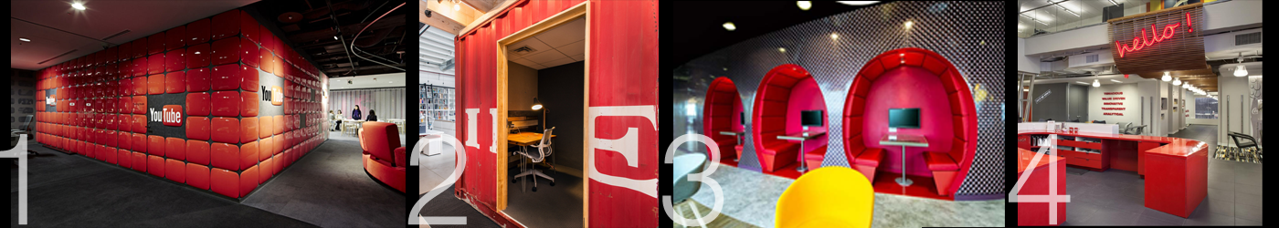
- Youtube creator space, Tokyo, via officesnapshots.com
- Cards Against Humanity, Chicago, via officesnapshots.com
- Kadvacorp best office space design features, conversation niche, Dublin
- RetailMeNot’s office pantry designs on mblubut.net
2. Orange
Red might be hot but orange is hotter; actually orange is the hottest color of all, according to Eiseman. Combining the drama and passion of red with the good humor and stimulation of yellow, it conveys energy, happiness and a bit of youth. As a color in the workplace, gregarious, outgoing orange is especially suitable for lobbies, lunch rooms and conference rooms, but it can also be used as an accent color on walls, flooring and accessories.
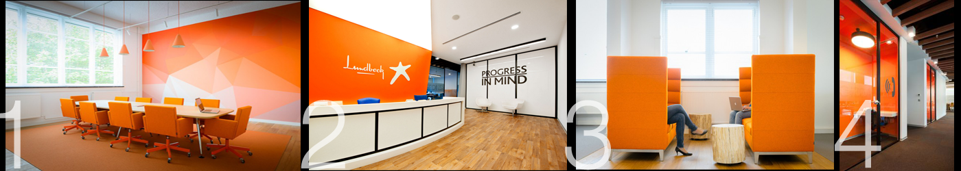
- rb2 office conference room, Netherlands, via officesnapshots.com
- Lundbeck office reception, Istanbul, via officesnapshots.com
- rb2 work-lounge-talk benches, Netherlands, via officesnapshots.com
- Lundbeck private meeting-working spaces, Istanbul, via officesnapshots.com
3. Yellow
Red is a showstopper but yellow is a spotlight. It’s the color the human eye sees before noticing any other colors. Described as cheerful, playful, glowing and energetic, it’s another great color for any focal point in your company. Use this color in the workplace to brighten up rooms that might otherwise be somewhat dark or drab (such as basement work areas and interior rooms that don’t have natural light).
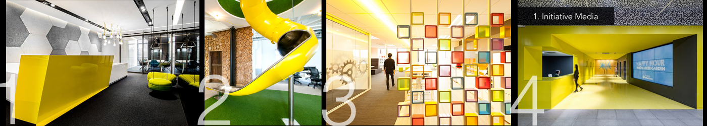
- Freshmail reception area, Krakow, via officesnapshots.com
- Peer 1 hosting employee slide, Southampton, via officesnapshots.com
- stack.co.nz Changing Wind in Office Design 2015
- Initiative Media reception area, New York City, via officesnapshots.com
4. Brown
Browns can vary from nearly red to nearly gray or black. This earthy gem is all at once calming, homey, grounded and substantive. Though most people respond positively to browns and earth tones, they can be a bit on the bland side if not combined with more energetic color counterparts. Use these deep earth tones in the workplace as a backdrop rather than a scene-stealer, from dark chocolate to light tan. It’s a great choice for walls where art will be displayed or for large pieces of furniture where you prefer a neutral to cover a big area rather than a color that might overpower the space or its occupants.
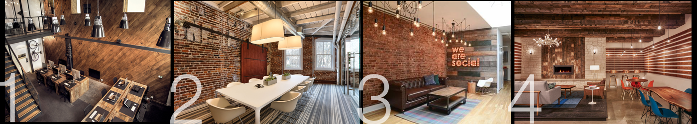
- Modern coworking space (unspecified) via glubdubs.com
- Tune conference room, San Francisco, via officesnapshots.com
- We Are Social waiting area via fatshackvintage.com.au
- Dropbox common space, Austin, via officesnapshots.com
5. Blue
Another calming color, blue finds its roots in both the sky above and the water of the deepest oceans, lakes and rivers. It’s color associations also vary widely when lightened or darkened, or when the hue is changed toward green, turquoise, purple or nearly black. It’s often the color choice for brands that want to inspire trust and the color blue can legitimately stimulate physical responses of calm and soothing. Use blue color in the workplace where you want to diffuse anxiety and maximize feelings of security and trust, such as human resources, co-working spaces like customer service departments, waiting rooms, sales spaces and break rooms.
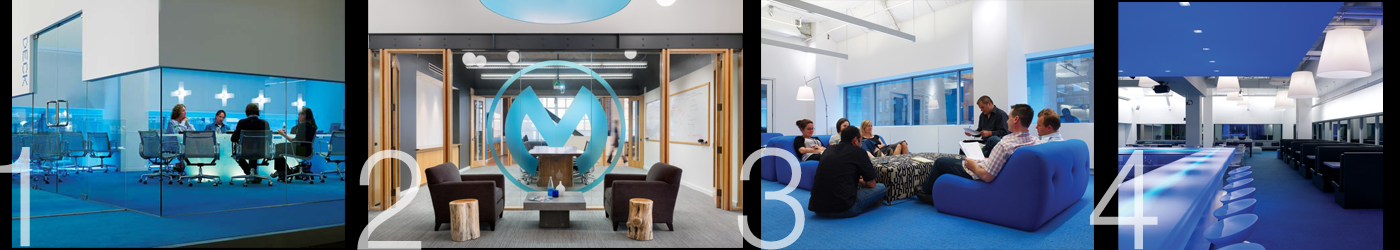
- Offices accented in blue, conference room, via officesnapshots.com
- Offices accented in blue, reception area, via officesnapshots.com
- Offices accented in blue, casual work-meeting space, via officesnapshots.com
- Offices accented in blue, common space, via officesnapshots.com
6. Green
The human eye can perceive more variations of green than any other color. Widespread in nature, greens denote growth, serenity, health (think “spa”), cleanliness, earth-consciousness and energy, depending on hue and intensity. Green is a great choice for the workplace since it’s almost universally pleasing. Use green color in the workplace in common spaces, work spaces for creatives, indoor spaces where you want to bring the outdoors in, waiting rooms and more.
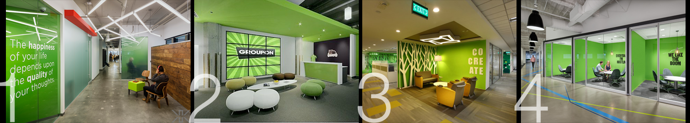
- Kamus + Keller project ‘Fuhu’ transitional space via kkaia.com
- Groupon reception area via forbes.com
- Boston Consulting Group creative space, Gurgeon, via officesnapshots.com
- Rocket Fuel small meeting spaces, Chicago, via officesnapshots.com
7. Purple
“It’s complicated.” For many people, purples are an enigma. It’s got the passion and energy of red mixed with the soothing safety of blue, making it somewhat intense as a color in the workplace. This color is often associated with royalty and luxury because at one point in history, only the very wealthy could afford fabrics dyed in purple hues. Its lighter shades are less intense and more youthful and (as with pinks) are often associated with feminine or infantile qualities.
You can use deep purples in the workplace to convey luxury, comfort and relaxation in executive and other VIP spaces, or turn to lighter purples to soften up what might otherwise be super-masculine spaces dominated by gray and black.
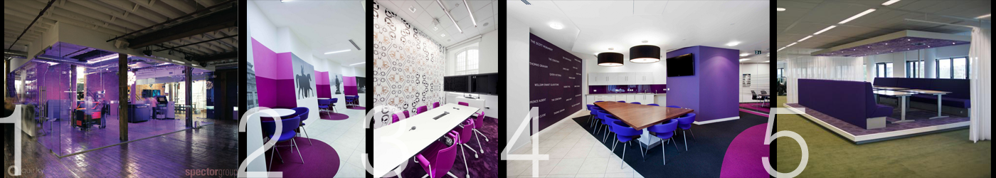
- Copier work room, Offices Clad in Purple via officesnapshots.com
- Employee lounge, Offices Clad in Purple via officesnapshots.com
- Teleconference room, Offices Clad in Purple via officesnapshots.com
- Conference room, Offices Clad in Purple via officesnapshots.com
- Large conference room, Offices Clad in Purple via officesnapshots.com
8. Neutrals
We often turn to neutrals as anchoring colors, offering a calm backdrop for walls, flooring and furnishings which in turn allow artwork and colorful accents to “pop” against a nondescript background. However, you don’t need to be afraid of bold color in the workplace; you can also use neutral accents and artwork to break up and give visual relief against bright, vivid large spaces and furnishings. When blended in workspace décor and furnishings, neutrals can create a calm, nature-referencing environment made interesting by textures (such as reclaimed wood walls and furnishings) instead of bold colors. Neutrals are often combined in marketing and advertising for luxury products, especially in combination with black, the ultimate luxe color.
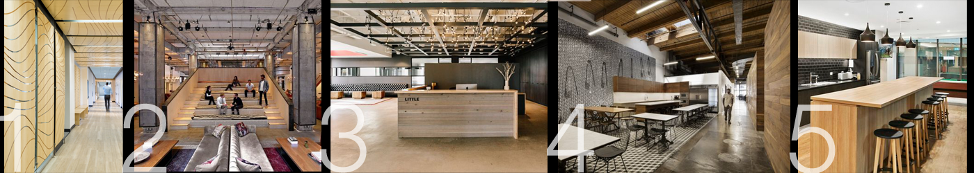
- Meltwater hallway, San Francisco, via officesnapshots.com
- Neuehouse coworking offices, New York City, via officesnapshots.com
- Little Offices reception area, Minneapolis, via officesnapshots.com
- VICE common space, Toronto, via officesnapshots.com
- Nude by Nature lounge, Sydney, via officesnapshots.com
9. White
White is anything but boring. It practically screams words like clean! cold! pure! simple! light! sterile! In the workplace, white can be used both to neutralize and to bring forward, making it a versatile choice when used strategically.
Use white where you want to make walls “disappear” against more interesting décor like a window wall or skylights. Use white as a divider, path-designater or to create visual relief. Use white to maximize light in dark spaces. Use white to make a room feel warmer – or colder. Use white as the background for art walls and focal points. Use white with blacks and grays when you want a room to feel luxe, chic or urban, or with light neutrals when you want a space to feel ultra-simple and clean.
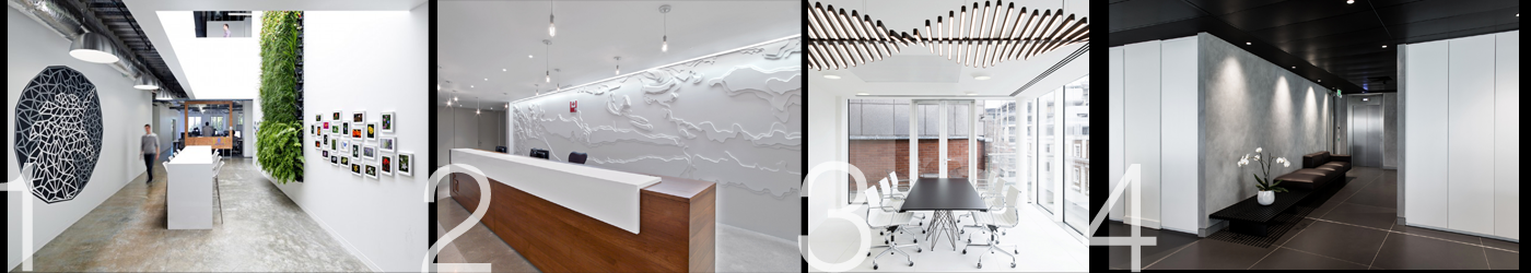
- Facebook art walls, Menlo Park, via officesnapshots.com
- LinkedIn reception area, Toronto, via officesnapshots.com
- Gemcorp conference room, London, via officesnapshots.com
- Gemcorp transitional space, London, via officesnapshots.com
10. Black
There are whole industries and cities whose professionals would agree with the following statement made famous by the iconic Wednesday Addams, “I’ll stop wearing black when then invent a darker color.”
Chic, elegant, timeless and expensive – these are all perceptions you can convey when you choose black as a dominant color in the workplace. Since you can use black to create drama, it makes for a fantastic choice for art and focus walls. Many creative types will be totally comfortable with its dark overtones covering large spaces or furnishings.
You can use black and charcoal to create soothing, quiet study, research and working environments or use it take your conference room to a sophisticated level. Pair with white to tell a story in stark contrast or use it to allow nearby bright colors to take center stage.
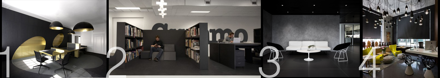
- i29 executive office space via dornob.com
- Gummo ad agency research space, Amsterdam, via officesnapshots.com
- Gemcorp lounge space, London, via officesnapshots.com
- Sergey Makhno Architects, casual workspace, Kiev, via officesnapshots.com
You might also like: Color Can Improve Your Brand Identity
Color in the Workplace Infographic
Below you’ll find our infographic titled, “10 Ways to Use Color in the Workplace” listing these ten colors and their meanings along with a short list of spaces where these colors can be used, strategically, to set a mood, make a statement or reinforce your brand presence with internal and external stakeholders. Feel free to share – if you do, we would appreciate a link back.